
Design You Can Feel: Lessons from Session Goods’ Effortless Web Experience
By: Shaniece N. Fullove, MPA
When it comes to shopping online, I like it to feel like a walk in the park — clear skies, easy path, no guesswork. I want to know where I’m headed and why I want to get there. That’s exactly how Session Goods makes you feel the moment you land on their site.
Everything about their digital experience is intentional: the layout breathes, the visuals glow, and the story unfolds without saying too much. It’s an instant reminder that good design isn’t just seen — it’s felt.
🌿 Designing with Purpose
Session Goods approaches web design with intention and ease. Every element — from navigation to color palette — works together to create a clean, functional flow that keeps users curious and confident.
The layout is simple but powerful. Navigation is right where your eyes expect it to be, buttons stand out without feeling pushy, and the imagery feels editorial rather than transactional. It’s calm, organized, and quietly persuasive — the kind of design that makes you want to stay awhile.
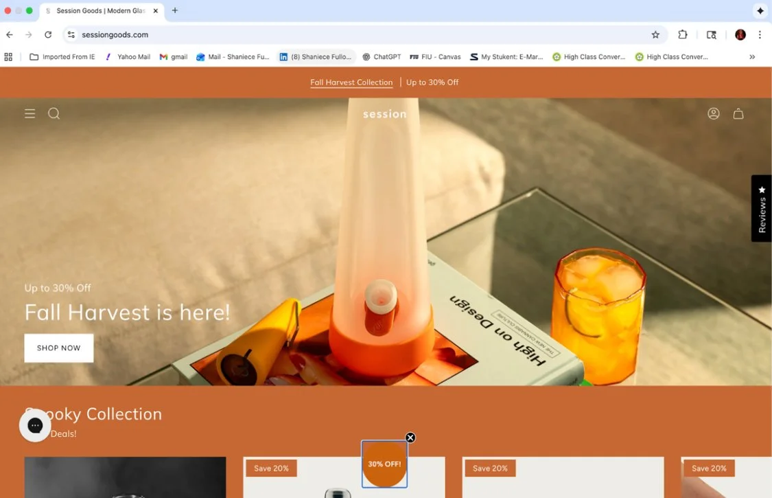
Whether you’re exploring their Fall Harvest Collection or checking out their seasonal product drops, everything about the journey feels seamless. You don’t get lost or second-guess your next step. You just move — naturally — from curiosity to cart.
🍂 Conversion in Motion
Session Goods has mastered conversion-centered design — guiding you toward a purchase without breaking the spell of calm.
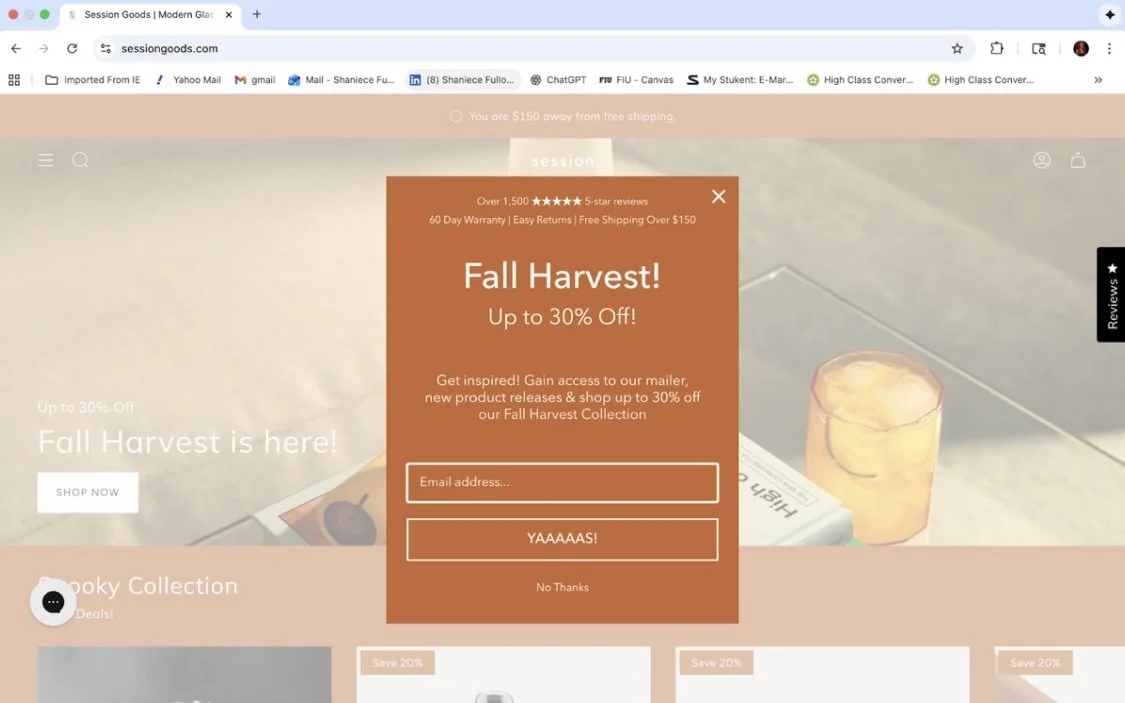
Calls-to-action like “Shop Now” or “Add to Cart” are bold but balanced, always supported by clean photography and warm copy that feels human. One of my favorite touches? Their Fall Harvest promo pop-up. It’s bright, seasonal, and instantly communicates value (“Up to 30% Off”). But what really seals the deal is the personality — the “YAAAAS!” button turns a basic sign-up form into a fun, brand-right moment.
It’s proof that personality converts. A little joy can do a lot of heavy lifting in ecommerce.
🧠 Built for Every Customer
Session Goods also understands its audience — which is why the site feels effortless for both seasoned consumers and newcomers.
For those already familiar with the brand, the interface reads premium — clean lines, confident typography, modern product photography. For first-timers, it’s warm and approachable, never intimidating.
Their product categories are cleverly designed around moods and moments. Think: Halloween-themed “spooky bongs” next to a cozy Fall Collection that doubles as interior art. It’s playful and curated — a smart move that invites exploration without confusion.

📱 Designed for the Way We Scroll

The Session Goods site translates beautifully across desktop, tablet, and mobile — a rare feat for brands with heavy visuals. Whether you’re browsing at your desk or from your phone in line for coffee, everything fits perfectly.
The imagery stays crisp, navigation remains intuitive, and buttons are large enough to tap without zooming in. It’s the kind of mobile-first design that respects modern shopping habits — clean, fast, and on-brand no matter the screen size.
🔍 Conversion by Design
Even the smallest details speak to thoughtful design. You’ll find trust symbols — like star reviews, warranty notes, and free shipping thresholds — right where they matter most. They don’t crowd the page; they build confidence.
Session Goods also knows how to keep the experience visually alive. Their fall color refresh brings cozy tones and golden highlights that feel seasonal without overwhelming the minimalist aesthetic. Its strategic design is wrapped in good taste.

💡 Takeaways: Design You Can Feel
Session Goods proves that great design doesn’t have to shout. It invites, reassures, and converts — all in one smooth flow.
Steal this mini playbook:
Make it easy. Clear navigation builds trust faster than flashy effects.
Design for flow. Every click should feel like the next natural step.
Keep it fresh. Rotate visuals and color palettes to reflect the moment or season.
Let personality lead. Copy like “YAAAAS!” turns clicks into connection.
Think mobile-first. If it’s not easy to tap, it’s not easy to buy.
Session Goods reminds us that web design is more than pixels — it’s experience. It’s about how a customer feels while shopping and how easily they move from curiosity to conversion. When design feels this natural, engagement doesn’t need to be forced.